|
We had to create 15 logos on a sheet of paper then choose the best 3 and vectorize it. Then we would have to make 3 variations to those logos with different concepts/colors.The most frustrating or challenging part of the process was the design choices and the color choices I had to make for these 3 variations. I had a hard time thinking of ways to innovate my designs without being too repetitive. My favorite thing about this process was in the end, seeing everything I had done when I finished doing it because it was very satisfying to see everything I tried to do work out in the end product. I learned and improved my skills in vectorizing things and I think I can apply this in the future too. 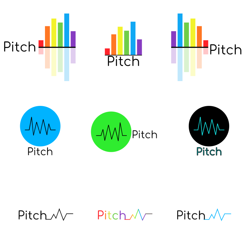 The name of the brand is Pitch and it is a music app that lets you listen to music. The purpose of it is to make it easier and more convenient for the person to listen to music. The logo represents the brand because the logo is vibrant and colorful which shows that we are friendly and welcoming while also being helpful and innovative. This logo is my favorite because it is full of color and the image looks cool and shows what our company is about and what it does. Something important would be the font choosing because if I used the wrong font, even though my logo was good, the logo would look so much worse since the font just doesn't match. 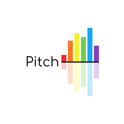
0 Comments
I decided to choose the logo with sound frequency in a circle and the name of the brand under it and another one was one where someone is listening to music and its shown by the music frequency coming out of their ears. The last one is a rectangular sound wave and there's a mirror of it below it too with the brand name under it. Out of these three, I like the mirrored one the most and I don't like the sound frequency one in a circle because it can be misunderstood as a heartbeat monitor or a graph. The mirrored one is clearly a rectangle sound wave with a clear name underneath it. Out of all of them, I don't like the musical note ones because they are so overused and they don't look that good. I like the 2 humans dancing to music(left row and right now). The process was a bit hard because I overthink a lot of it and it was a bit hard to get 15 logos. 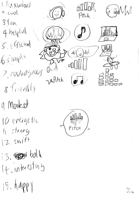 In this design, we had to go to Adobe Color and pick 4 different color palettes and the types were analogous, triadic, complementary, and monochromatic. Each palette has to have 5 colors. We have to then present the color palettes anyway we want. Analogous is a color palette where the hues are next to each other on the color wheel. Complementary combines hues from opposite sides of the color wheel. Monochromatic is just one hue but has various saturation and brightness levels. Triadic combines 3 hues evenly spaced out around the color wheel. I liked analogous because the colors had good contrast and they made the picture look good. 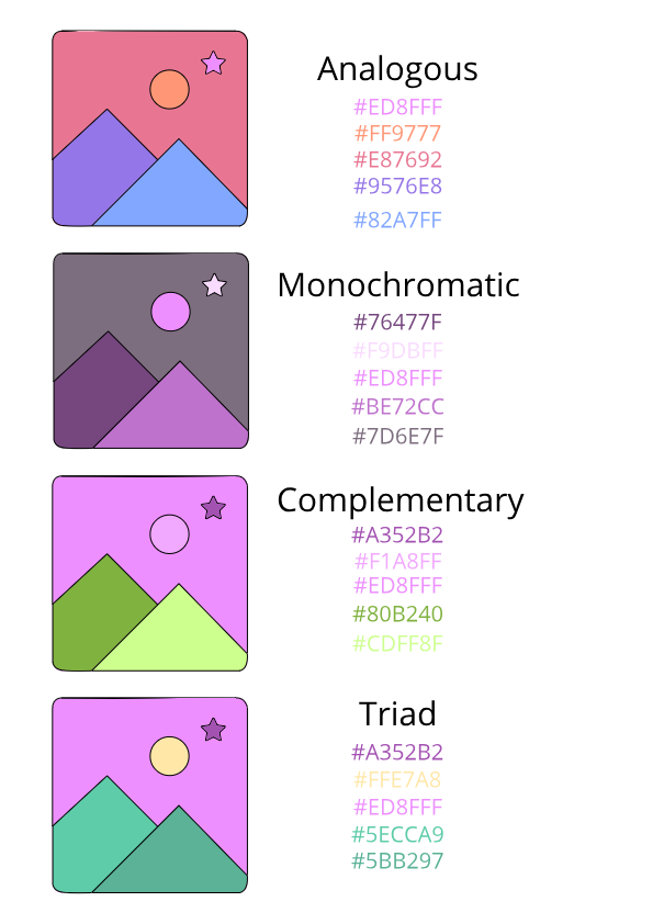 |
AuthorHello! My name is Jun and I'm the author of this page. hope you have a great time! CategoriesArchives
May 2019
 This work is licensed under a Creative Commons Attribution-NonCommercial-ShareAlike 4.0 International License. |
